Web design to simply student book buying
WUSA Used Books Aug 2024 – Dec 2024


I helped streamline workflow to help internal teams boost efficiency.
The WUSA Used Bookstore serves thousands of University of Waterloo students each term, offering discounted course textbooks and a sustainable alternative to buying new. However, its web experience lacked usability — students found it difficult to search for books by course, or understand pricing for used versus new editions.
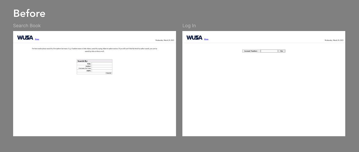
Working as a staff at the Used Book Store, I noticed frustrations from students: The existing website lacked a course-based search feature, making it difficult for students to know whether the bookstore carried the books they needed. In addition, pricing information wasn’t clearly presented, and sale items were hard to find — leading many students to miss out on affordable options.
To solve this, I led a full redesign of the e-commerce experience, where students could easily check the pricing and availability of textbooks for the specific courses they were taking.
Team
UX Designer (ME)
Project Type
Personal
Impact
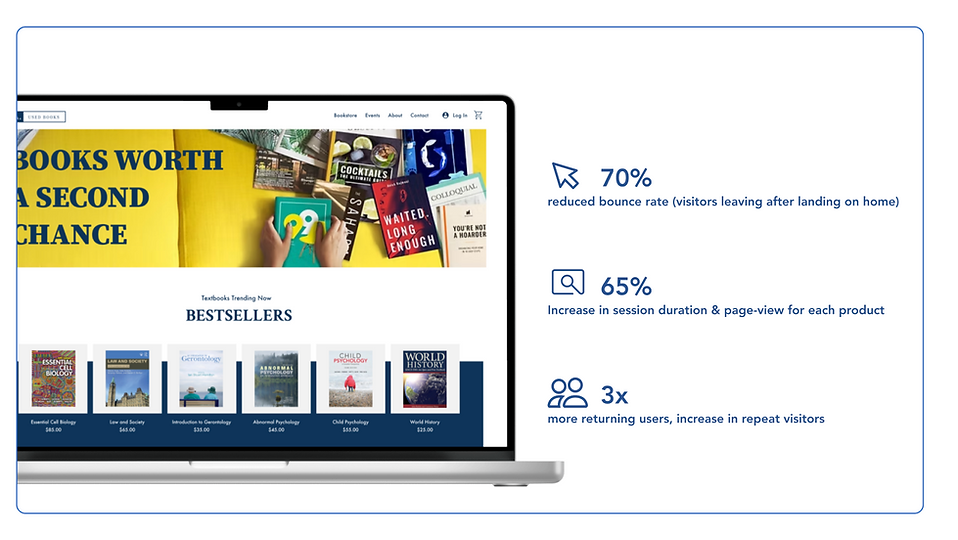
Launched in March 2023, the redesigned WUSA Used Bookstore site has significantly improved student engagement. Bounce rates dropped by 70%, session duration and product page views increased by 65%, and returning users tripled—showing a clear shift toward a more efficient and user-friendly experience.
*These metrics were gathered through Google Analytics to track user behavior before and after the redesign.
This case is a lengthy read, so in case you don't want to scroll, here is a shortcut :)
How might we redesign the used bookstore to simplify finding course textbooks, highlight affordable and sustainable options, and support students throughout buying and selling cycles?
DESIGN CHALLENGE

Gathering
Requirements
I began by identifying core usability issues and setting design goals focused on student needs. From accessibility and responsiveness to navigation and load speed, I prioritized a clean, student-friendly interface that aligned with campus branding and worked seamlessly across all devices.

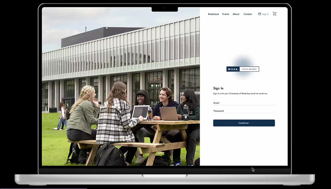
Navigation Structure
The navigation was designed to reflect how students shop—starting with course-based browsing, finding deals, and checking out quickly. Key actions like Bookstore, Events, and Cart are prioritized, while About and Contact offer helpful context without distraction.

Mood-board
I went ahead and got started on the moodboard before designing the prototype, to have a better idea of what vibes I wanted the website to have. I focused on a clean, student-friendly aesthetic using soft, campus-inspired colors, minimal typography, and approachable iconography. The goal was to have a balance between academic and inviting—something that felt helpful, affordable, and easy to use.

The "Search" functionality
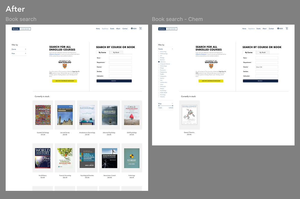
The search functionality was one of the most important areas I focused on during the redesign. In the old website, students had to scroll through long, unorganized lists with no clear way to search by course code or filter by relevant categories. I implemented a more efficient search experience by introducing course-based filtering, clearer input fields, and an improved layout that guides users to results faster. The new UI is clean, intuitive, and designed to reduce friction—making it easier for students to quickly find the exact textbook they need.
Final Product
By focusing on real student pain points—like confusing navigation and lack of clear search functionality—I was able to deliver a solution that’s both practical and visually engaging. The redesigned website not only reflects the bookstore’s mission of sustainability and affordability but also helps students save time, money, and stress when preparing for their courses.